
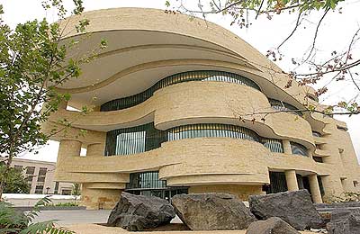
This past Thursday my friend and I decided to visit the National Museum of the American Indian (NMAI) with the goal of playing with as much in-gallery technology as possible. Neither of us had been to NMAI before so we weren’t sure what to expect, or even what technology would be available to us. Luckily for us, the museum was relatively empty on Thursday, perhaps due to the all-day rain or because it was the middle of the day on Thursday, but whatever the cause it meant my friend and I could take as much time with our finds as we wanted.
For those who haven’t visited the NMAI at all, or it’s been a while, let me refresh your memory on the layout. The visit actually begins on the fourth floor and you slowly work your way down to the final galleries on the second floor. On the fourth floor, before you even enter the first official gallery space, you encounter a massive glass case that is filled with a variety of objects, each depicting an animal in some way. In front of the cabinets are small kiosks that allow visitors to click on the picture of an object in the cabinet, learn its origin, date of creation, and material as well as zoom in on the object to see it up close. I was immediately excited about this, hoping to gain some insight into what exactly the object meant to its perspective culture, and also to have the ability to play the first touch screen I found.

I have to admit, however, I was a little disappointed by these animal kiosks. More often than not, there was no explanation of the objects cultural importance. So basically all the kiosks allowed us to do was zoom in and see details. While that is valuable in its own right since some of the objects were very small, I instantly craved more information. In addition, where there were opportunities to rotate an image, I found I had a difficult time getting the touch screen to rotate the image.
More frustrating than the temperamental touch screen were the automated drawers in those glass cabinets. Above the drawers was a sign that read “Pull Gently to Open, Push Gently to Close.” Sounds simple enough, right? Well turns out, it was not so simple. The drawers opened easily enough, allowing my friend and I to look at some carved pipes, but after about ten seconds the drawer would automatically close, without even the slightest nudge from us. It was incredibly frustrating to have to keep reopening drawers only to get a quick look before the drawer closed itself again. I understand that from a practical standpoint, the automatically closing drawers make sense. It alleviates the problem of people continually leaving drawers open after looking at their contents, but the timing definitely needs an adjustment. In addition, not all drawers functioned like they should have. That was actually a blessing for my friend and I, but consistency is important too. If a museum is going to insist on motorized drawers, make sure all of them going work correctly.

Once we finally moved into the galleries, drawers and stand alone kiosks made way for giant touch screens. The first gallery space Our Universes actually did not contain any touch screens which made the space, at least for me, a little boring. I was fascinated by the different cultures and their understanding of their worlds, but moving offshoot to offshoot eventually got a little monotonous. It was in many ways more of a traditional gallery viewing experience, but because of that first taste of technology I was desiring something similar throughout the rest of the museum.
Much to my happiness, there were touch screens in the Nation to Nation: Treaties Between the United States and American Indian Nations gallery. This screen was different from the kiosks; it was a lot larger for one, and it was pushed up against a wall rather than standing free in the middle of the gallery. Instead of just presenting information like a wall text, as the kiosk did, this screen presented its information like a game. The goal of the game was to decide which culture practiced what ritual during a treaty, such as smoking a pipe, singing your name, or sharing a meal. Each ritual had a little medallion that you dragged to the right culture (American Indian, American, or Both). My friend and I had a great time deciding where each ritual went and then when we matched them all correctly, we read the details for each.

The next in gallery technology that we encountered in the Nation to Nation gallery was another touch screen which focused on the relocation of American Indians throughout the United States. This touch screen allowed visitors to select a historical person and read their story. The stories were told through drawings like a story book and I was able to scroll across the screen to continue the story. This touch screen worked so well that my friend and I spent at least 15 minutes looking at the various stories and swiping left and right to scroll across the screen. As frustrating as the automatic drawers were, this screen was extremely user friendly and responsive which enhanced our learning experience.


The last gallery my friend and I explored was on the third floor and was a special exhibition titled The Great Inka Road: Engineering an Empire. As I came to expect, there were two different touch screens in the exhibition. One was a game where we were supposed to run messengers along the Inka roads by drawing paths between two cities. The premise was easy enough, but I found it rather difficult to trace the path in order to send the messenger. No matter how many times I ran my finger across the roads, the screen wouldn’t recognize the path I drew. My friend, on the other hand, had no problem with the screen. For whatever reason, the screen did not seem to recognize my finger long enough to work.
The final screen we encountered was the largest, by far. It was a table sized screen that displayed the ancient city of Cuzco. It was immediately enticing to play with as it’s purpose was not entirely clear, and I wanted to find out what it did. Turns out, the screen allowed me to click on different parts of the city as well as different land marks, and gain more information about them while also looking at their relationship to the rest of the city.
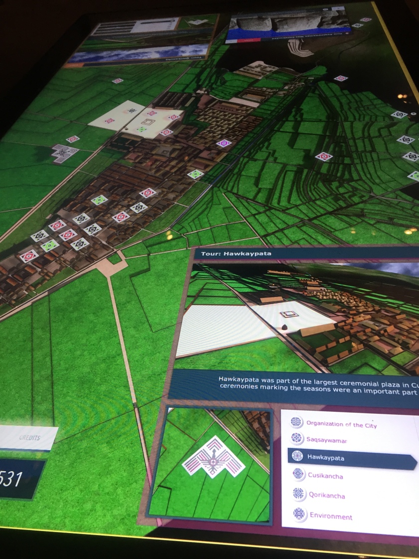
While this was fun for the first few minutes, I became disenchanted pretty quickly. It wasn’t that there was anything wrong with the screen, it worked really well actually and was very responsive to my touch, but I think I became “touch-screened out” by this point in my visit. I had seen so many touch screens after two hours inside NMAI and although they each had a different purpose they had sort of lost their appeal. I wanted something else to do in the gallery.
I understand that touch screens are an easy way to engage the visitor and they offer various ways to share information. They are clearly becoming a staple in museums, and perhaps even expected at this point. I can’t help but wonder, however, if they are a cop out for museums; that they are the quick and easy answer to giving museum visitors the in-gallery technology they want. How many touch screens does it take before they loose their magic? For me it was five.

Hi Amanda!
This is a very interesting take on in-gallery technology at NMAI. I visited the museum recently, and it seemed to me that the museum did not have many actual artifacts, documents, and other historical objects compared to in-gallery technologies, so I definitely agree with you about there being an abundance of touch screens there! I suppose it does depend on the person, but I myself usually become uninterested in touch screens after the first two. Then again, I am one of those people who will give in-gallery museum technologies in general a try, but focus mostly on the actual objects presented in the museum. I wrote about my experience with in-gallery technology at a museum I visited over the weekend for example, which honestly did not have many of those types of technologies. For me, however, the visiting experience was not hindered because of a lack of touch screens, kiosks, etc. Regarding the use of touch-screens in museums, it seems like that specific type of technology is maybe the most useful, convenient, and practical way to engage museum visitors, and perhaps that’s why they seem to be ubiquitous in museums as far as in-gallery technology goes.
LikeLike
I totally understand your point of view as I am always confused by in-gallery technologies. Although, at the beginning, I am excited to use applications or touch screens, I loose my enthusiasm very quickly. I seriously don’t remember any electronic device at the museum that wouldn’t disappoint me. I don’t want to deny that new technologies play important role at more and more exhibitions and might enhance visitors to pay a visit, but it’s definitely not my cup of tea.
LikeLike
Amanda – I am definitely with you on interactive overload. It’s actually rare that I will touch any interactive in an exhibition, and I am particularly overwhelmed by giant touch screens, especially if others are present. I much prefer the goofy photo ops exhibitions have offered to families and children for many years, as silly as that sounds. Who doesn’t love a great commemorative photo of the experience?! Anyway, it sounds to me like the NMAI needs a total tech overhaul in order to become consistent throughout the institution. I noticed issues like this as well the last time I visited. I also noticed the lack of consistency in terms of the variations in interactives. When I was there, there was an exhibit on the various first nations and their different modern adaptations of american culture into their own called Our Lives, and across the hallway an exhibition on Mesoamerican pottery. Our Lives was an overwhelming collage of video, music, images, high tech screens and artifacts. The pottery exhibit, in contrast, was dry as a bone, an essentially one way interaction between the curator and the visitor during which nothing else could be done but read labels and look. How much both these exhibits might have benefited from a comparison and adjustment in terms of their intertactives, I don’t know; I can only speculate. I do believe, however, that making them more consistent might have made both of them more interesting.
LikeLiked by 1 person